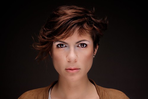
Lens: Voigtlander nokton 50mm f1.1
Camera: NEX-7, ISO200, f11, 1/125, raw
Four days ago I posted the result on my close-up portraits lighting studies. I was happy with what I got till several among you followers started listing all the things that I did wrong. That day I measured how good in evaluating photographs you are, and also how quick and precise your critics can be. I’m not complaining, quite the opposite, even if that night I had a very long and aching nightmare of me not being able to get a single decent shot at my first BIG fashion photo assignment. That’s how touchy I can get. By the morning after I already thought of two other possible lights set-up to answer to the critics you moved me, which are the following:
1) The eyes of the model look weirdly different from one another. One is darkish and volumetric, the other one is bright and flat.
2) The chin is missing.
3) There’s no shadow designing the jaw line.
4) The background is lit non-symmetrically (this one is a self-critic).
Today I found half an hour to test one of my ideas and my sister helped me by modeling for the shot. I’m quite happy with the result and I think it answers to the critics, but please feel free to express your thoughts as you did last time, because I really need to nail this light and compositional scheme before the end of the month.
Compared to the scheme I used last time, this one is much more simple and elegant. There’s just one light, hanging over the model’s head at forty five degrees and diffused by the 120x80cm softbox with grid, plus one silver reflector under the model’s chin to get some of the light back on the face. The white background gets a nice shade of dark grey with a little gradient making it brighter on the lower end and around the model’s face.
I’m thinking about showing this to my client as an example of what I would do with the models. Do you think it is fine? Do you like it better than the previous shot?


Thought I am not a expert for the critique (I use MR Light, the emergency light, covered with polythene wrapper for lighting ;D ), this one looks more pleasing and lighting is more even and defines the facial features..