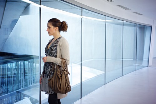
Lens: Voigtlander color-skopar 35mm f2.5
Camera: NEX-7, ISO400, f2.5, 1/60, raw
This was a productive day, at least photographically speaking. I have at least four good shots I wouldn’t mind using for the project. But I have to choose one. And this is the one I chose. But, please, feel free to click on it, it will bring you to the flickr page, and from there you can check the others out. Then, if you like, you can tell me if you would have done differently.
So, what about this place, MAXXI? Well, it is the Museum of Arts of the XXI century, and if you ever, EVER, happen to be in Rome you owe to pay it a visit. Full stop. It’s really an amazing structure, it shows perfectly how an architect can design a place which is an experience to walk trough. You can wiki-google it anytime, but in case you don’t here are some basic info about it: it designed by the Iraqi architect Zaha Hadid, who studied first mathematics at the University of Beirut and then Architecture at the Architectural Association. It is placed in the neighborhood Flaminio, at walking distance from our current home (well, you won’t find this info in any wikipedia, so it was worth reading this post, wasn’t it).
The museum is hosting the exhibition Re-Cycle, in which the curator presents “recycling as one of the maximum producers of creative innovation”. I didn’t really get most of the “works of art”, but that must be my fault since I don’t really get most of the contemporary art anyway. I don’t want to sound polemic, I know it’s too easy to blame contemporary artists of being just weird, but it’s true that at a certain point in the last century arts and people took different paths, and that now you have to get a PhD in architecture or fine arts in order to figure out the meaning (and the beauty) of most of the new exhibited art. This “detachment” between artists and people has affected photography as well, but to a minor extent. Yet.

cool, clear and almost clinical.
how strong did you edit the pic while processing it?
difficult to imagine that the shown environment is real. very nice!
how strong? what sort of language is that? 🙂 fortunately you have understood what my intention was.
btw: the pic above is my favorite of your sunday trip. funnily enough, i had already chosen and favored it at flickr before you published your daily posting.
not much post-processing, just the usual curves, contrast, and sharpness on the raw file. But I could have get the same effect directly on the out-of-camera jpeg. The place is strongly monochromatic, the windows are bluish, and this was shot in the bluish hour preceding sunset. Finally, consider that in shots like this one you have to white balance the interior, which usually is lighted by light bulbs, hence you have to add blue to contrast the yellow. So, the outside, which has a different white (more on the blue side) gest super blue.